What is a management dashboard? Types, examples and how to make it useful
What a management dashboard (or scorecard) is, its types, including the balanced scorecard, KPI examples, Excel dashboards and how a scorecard differs from a dashboard.
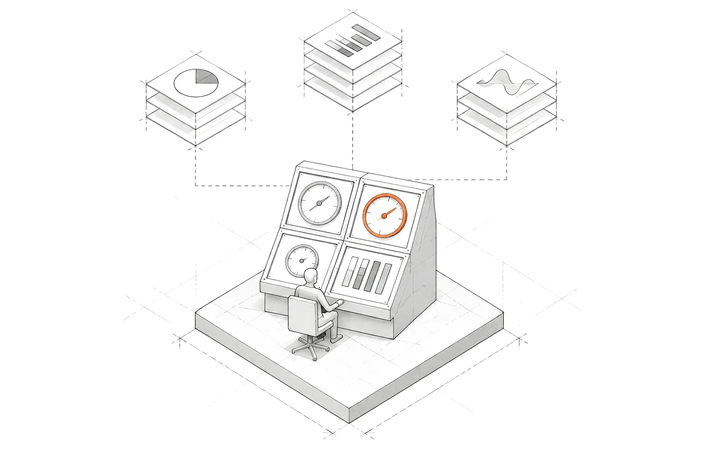
A management dashboard is a management tool that brings together, in a single view, the key indicators (KPIs) a company uses to track whether it’s heading towards its goals and to decide what to do. It isn’t a report with all the available data: it’s a short selection of metrics, each tied to a business question, with its target and its trend.
The idea comes from cars and aircraft: the dashboard is what the driver looks at to know, at a glance, whether everything is fine. In a company the idea is the same, and so is its main risk: a dashboard with forty gauges doesn’t help anyone drive.
What a management dashboard is for
A useful dashboard answers three questions every week or every morning:
- How are we doing against what we expected? Every indicator with its target or comparison period.
- What needs attention? Whatever has gone out of range, at the top and with its explanation.
- What do we do? If an indicator can’t lead to any decision, it doesn’t belong.
Types of management dashboard
Depending on who uses it and over what horizon, three levels are usually distinguished:
- Operational. For a team’s day-to-day work: pending orders, open incidents, this week’s capacity. Checked daily and updated almost in real time.
- Tactical. For department heads: sales by line, project deadlines, costs against budget. Checked weekly or monthly.
- Strategic. For management: a few indicators tied to the company’s medium-term goals, such as growth, margin, customer retention or staff turnover.
The balanced scorecard
The balanced scorecard was proposed by Robert S. Kaplan and David P. Norton in a 1992 Harvard Business Review article. Their idea: don’t measure a company only with financial indicators, which tell you what has already happened, but balance them with other perspectives that anticipate what will happen. The four classic ones are:
- Financial: revenue, margin, cash flow.
- Customer: satisfaction, retention, market share.
- Internal processes: lead times, quality, efficiency.
- Learning and growth: team capabilities, systems, improvement.
It’s a good framework for not forgetting any perspective. The risk is turning it into a box-filling exercise: twenty indicators per perspective that nobody looks at.
KPI examples for a management dashboard
Examples by area, with the question each one answers:
- Management: revenue for the period against the same period last year (are we growing?), outstanding payments (do we have cash?), projects at risk (what could go wrong?).
- Sales: opportunities by stage (is there a pipeline?), leads unanswered for more than 48 hours (are we responding?), where customers come from (which channel works?).
- Operations: team capacity used (can we take on more work?), deadlines at risk (what’s going to slip?), stalled work (where’s the bottleneck?).
- HR: headcount, absences, logged hours and turnover (do we have the team we need?).
Excel dashboards
Almost every company starts with a dashboard in Excel, and that’s not a bad place to start: it forces you to choose indicators and it’s easy to change. The problems show up as it grows:
- Someone builds it by hand every Monday, exporting from several systems. If an export fails, nobody knows.
- Formulas break when a row is copied or a source column changes.
- Every department has its own version, and the figures don’t match.
- It arrives late: by the time the report is ready, the decision has already been made.
The natural next step is to connect the dashboard to the source data, so it updates itself and says when its figures are from. That can be done with a tool like Power BI, as I explain in how to design a Power BI dashboard management actually uses, or with a custom KPI dashboard when the logic is your own.
Scorecard and dashboard: are they the same?
In practice they’re used almost interchangeably. If you want to tell them apart:
- Scorecard puts the emphasis on management: which indicators, with which targets and for which decisions.
- Dashboard puts the emphasis on the screen: how those indicators are displayed.
A good dashboard with no scorecard behind it is a pretty screen. A good scorecard on a bad screen goes unused. You need both.
How to make a management dashboard useful
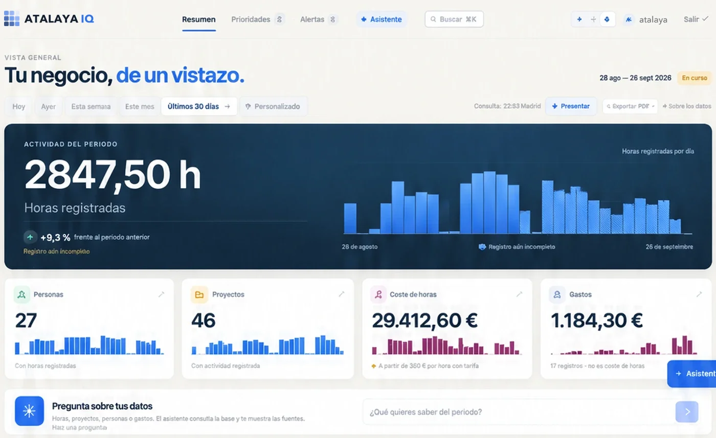
What I’ve learned building management dashboards, for example in AtalayaIQ, over seven years of a national events company’s operational data:
- Few indicators. Its front page sums up the situation in three lines and shows at most 15 prioritised actions.
- Fair comparisons. Each day against the previous day of the same type, at the same logging delay, so it never reports drops that don’t exist.
- What can’t be claimed, left out. If the data doesn’t allow the margin to be calculated, the dashboard doesn’t show it.
- What needs attention, first, with the evidence that explains it.
A management dashboard isn’t measured by how many indicators it has, but by how many decisions it changes.
Management dashboard FAQ
How many indicators should a dashboard have?
The ones that answer the questions decisions are made on. For management, one screen without scrolling is usually enough: between five and ten indicators, plus a short list of what needs attention.
What’s the difference between a KPI and a metric?
Every metric measures something; a KPI is a metric chosen because it shows whether the company is moving towards a specific goal. A management dashboard should contain KPIs, not every metric available.
How often should a dashboard be updated?
As often as the decision needs: almost in real time for operational ones, daily or weekly for management. What matters is that it says when its data is from.
Excel, Power BI or a custom dashboard?
Excel to get started and choose indicators. Power BI when the data is in order and the questions are standard. A custom dashboard when the logic is your own or it has to be built into the team’s tools.
If you want a dashboard management actually uses, custom KPI dashboards explains how I design one, from the question to the data source.