Power BI dashboard: how to design one management actually uses
What a Power BI dashboard is, how it differs from a report, examples by area and how to design it so management decides with it. And when Power BI isn’t enough.
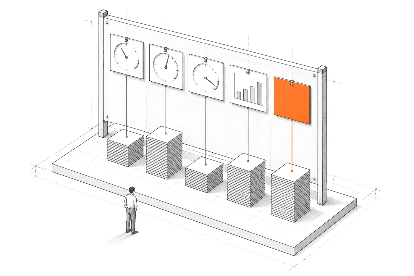
A Power BI dashboard is a single page holding the most important visuals from one or more reports, designed to show at a glance how the business is doing. For management to actually use it, you don’t need more charts: you need few questions, well-defined metrics, fair comparisons and an upfront decision about what the dashboard must not claim.
Almost every company running on Microsoft 365 has had a Power BI dashboard at some point. Many opened it enthusiastically in month one and forgot it by month three. Not because Power BI is a bad tool, but because the dashboard was built backwards: first the available data and every possible chart, then the hope that someone would find something useful.
This article goes the other way: from the questions to the dashboard.
What a Power BI dashboard is (and how it differs from a report)
In Power BI, “dashboard” and “report” are different things, and it pays not to mix them up. According to Microsoft’s documentation:
- A dashboard has a single page. A report can have several.
- A dashboard is built by pinning tiles (visuals) from one or more reports, which in turn are based on semantic models.
- Dashboards only exist in the Power BI service. In Power BI Desktop you create reports, not dashboards.
- A dashboard can’t be filtered or sliced. To explore, you go to the report behind it.
- Dashboard tiles support alerts in certain circumstances, something reports don’t offer.
In practice, many people call a one-page report with filters a “dashboard”. That’s fine, as long as the team knows what it’s talking about. What matters isn’t the name, but which questions the screen answers.
How to design a Power BI dashboard management actually uses
This is the order I follow, in Power BI or any other tool:
- Write down the questions. The ones asked every Monday in the management meeting, in their own words. If they can’t be written down, the dashboard isn’t needed yet.
- One metric per question. And drop the ones that answer none, even if they’re available.
- Define every metric in writing. What counts, what doesn’t, over what period and from which source. “Sales” isn’t a definition.
- Compare fairly. Today against the same weekday last week, at the same logging cut-off. If today’s data isn’t complete yet, comparing it with a closed day invents drops.
- Show the cut-off date. Every dashboard should say when its data is from and which part is incomplete.
- Decide what not to claim. If the database doesn’t contain the margin, the dashboard doesn’t show an estimated margin as if it were a fact.
- Put what needs attention at the top. A short list of anomalies is worth more than ten trend charts.
Step 6 is the one most often skipped and the one that does the most damage. I went into it in before building a dashboard, decide what it won’t claim.
Power BI dashboard examples by area
Four examples of what tends to work, with the typical trap in each:
- Management. Revenue for the period, outstanding payments, projects or orders at risk and a list of what needs attention. Trap: mixing figures with different cut-off dates on the same page.
- Sales. Pipeline by stage, opportunities with no activity, where customers come from and conversion. Trap: measuring the pipeline with statuses each salesperson uses their own way.
- Operations. Team capacity, hours per project, deadlines at risk and stalled work. Trap: comparing half-logged days with closed days.
- Finance. Variance against budget, margin by line and expected cash. Trap: showing a margin calculated with incomplete costs.
In all four, the hard work isn’t in Power BI. It’s in the data that reaches Power BI.
Power BI’s limits: when you need something custom
Power BI is a good tool and often the right choice. There are situations, though, where it falls short or where the problem lies underneath:
- The data has traps. Entries made days late, fields repurposed for something else or half-closed periods. That gets solved in a data layer, not in the chart.
- The logic is your own. Comparisons at the same logging cut-off, alerts with their evidence or actions prioritised by business rules.
- The dashboard has to live inside the tool your team already uses, not in another application with its own login.
- What you need is a report that arrives ready every morning, not a dashboard someone has to remember to open.
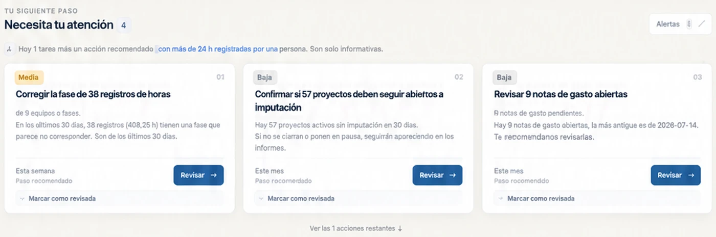
In AtalayaIQ, an intelligence layer over seven years of a national events company’s operational data, the front page isn’t a catalogue of charts: it’s a short list of actions, each with the evidence that triggered it. That logic could be approximated in Power BI, but it lives better in a system built for it.
A Power BI dashboard doesn’t fail because of Power BI. It fails because of the questions nobody wrote down before opening it.
Power BI dashboard FAQ
Can you create a dashboard in Power BI Desktop?
No. In Power BI Desktop you create reports, which can have one or more pages. Dashboards are created in the Power BI service by pinning visuals from those reports.
Which licence do you need to create dashboards?
According to Microsoft, creating dashboards in workspaces requires a Power BI Pro or Premium Per User licence. Without one, you can create them in “My workspace”. Licensing terms change: check the current documentation before deciding.
How many charts should a dashboard have?
The ones that answer the questions decisions are made on. In my experience, a useful management front page fits on one screen without scrolling, with a list of what needs attention at the top.
Power BI or a custom KPI dashboard?
Power BI, if the data is already in order and the questions are standard. A custom KPI dashboard, if the logic is your own or the dashboard has to be built into your tools. If what you’re after is help with Power BI, custom Business Intelligence explains when I work as a Power BI consultant and when I propose something else.
If your company has a dashboard nobody opens, or data nobody believes, start with the questions: custom KPI dashboards explains how I design a management dashboard from the question to the source.