S.02 / DASHBOARDS

Custom KPI dashboards for management that answer real questions.

A company KPI dashboard brings together the few indicators management decides with. I design it custom, starting from the question rather than the chart: what you need to know every morning, which data answers it and what to do with the answer.

A dashboard that starts from the questionThe business question, the metric that answers it, its definition and the data source shape a dashboard that delivers the answer, what needs attention and the next step.01QUESTION02METRIC03DEFINITION04SOURCEDASHBOARDANSWERATTENTIONNEXT STEPA dashboard that starts from the questionThe business question, the metric that answers it, its definition and the data source shape a dashboard that delivers the answer, what needs attention and the next step.QUESTIONMETRICDEFINITIONSOURCEDASHBOARDANSWERATTENTIONNEXT STEP

02 / PROBLEM

Nobody needs more charts. They need answers.

A dashboard you have to interpret for ten minutes isn’t a dashboard. It’s an exam.

Most dashboards are built backwards: the available data gets connected, every possible chart gets drawn and everyone hopes someone finds something. The result is a screen that gets opened in month one and forgotten by month three.

A useful dashboard starts from the questions asked in Monday’s meeting and ends in an action. Anything that doesn’t help answer them is surplus.

And underneath it needs a layer that guarantees the figures are true. That layer is Business Intelligence; the dashboard is the part you see.

03 / SIGNALS

Your dashboard isn’t answering.

If the dashboard doesn’t change what you do on Monday, half of it is surplus or the question is missing.

  1. 01The current dashboard has thirty charts and nobody knows which one to look at.
  2. 02Every meeting starts by arguing whether the figure is right.
  3. 03People open the dashboard, look at it and go back to Excel to decide.
  4. 04The data arrives a week after it was needed.
  5. 05You have to open four tools to find out how a project is going.
  6. 06Nobody notices a problem until a customer mentions it.
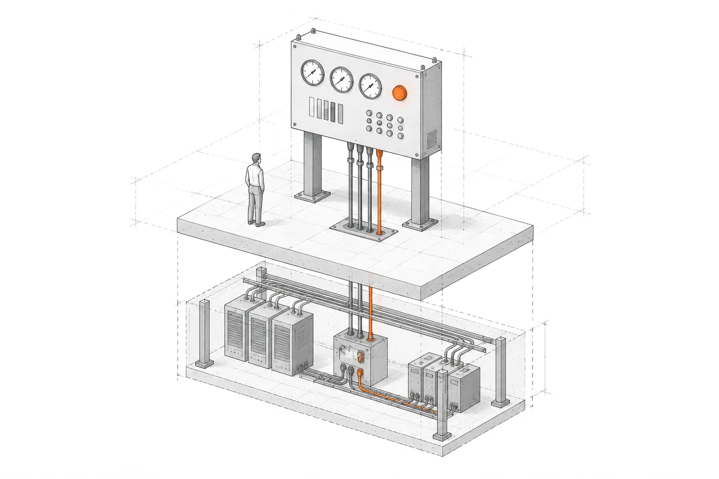
FIG. 03Few indicators; one lit up, with its cable down to the data
Axonometric drawing of a control panel with few indicators and one orange light on, its cable running down through the floor to neatly arranged data blocks; a small human figure looks at the panel

04 / FIT

When a custom dashboard is worth it.

When the questions repeat and the answer is still put together by hand.

Building makes sense if…

  • Management asks the same questions every week and answering them takes hours.
  • The answer needs data from several systems that no single tool sees together.
  • The dashboard has to highlight what needs attention, not just show numbers.
  • It has to live inside a tool the team already uses.

05 / KPIS

Dashboard KPIs by area.

Four areas, few indicators in each. What gets measured is decided before anything is drawn.

  1. FINANCE

    Revenue, margin by line or customer, outstanding payments and variance against budget, with the cut-off date visible.

  2. OPERATIONS

    Team capacity, hours per project, deadlines at risk and stalled work, as in AtalayaIQ’s management view.

  3. SALES

    Pipeline by stage, unanswered leads, where customers come from and conversion, with pending follow-ups up front.

  4. HR

    An HR dashboard: headcount, absences, logged hours and turnover, with personal data protected and role-based access.

06 / QUESTIONS

What questions your dashboard would answer.

Every view comes from a question. These are already answered in real systems.

  • 01

    Which projects need attention?

    A short, prioritised list (open projects with no activity, records to fix, pending expenses) with the evidence for each one.

    EvidenceAtalayaIQ

  • 02

    Where are costs piling up?

    Hours cost and expenses per project, with explicit coverage: which share of the hours has a rate and which doesn’t.

    EvidenceAtalayaIQ

  • 03

    How much capacity does the team have?

    Hours logged per day, people with activity and each project’s weight over time, to see the load before it shows.

    EvidenceAtalayaIQ

  • 04

    Which leads have waited too long?

    Pending follow-ups, leads by status and those with recent activity, before they go cold.

    EvidenceZentia

  • 05

    What changed since yesterday?

    A comparison with the previous period at the same logging cut-off, with the change that explains it. No false drops from half-logged data.

    EvidenceAtalayaIQ

  • 06

    Where do customers come from and what do they look at?

    Leads by source, the most viewed items in the catalogue and an activity map to see what’s working.

    EvidenceZentia

07 / ARCHITECTURE

Designed from the question to the source.

The opposite of most: first what has to be decided; the charts come last.

FIG. 07Question → metric → definition → source → view → action
  1. 01 — QUESTION

    The question

    What the decision-maker needs to know, and how often.

    • DIRECTION
    • TEAM
  2. 02 — METRIC

    The metric

    Which number answers that question, and which doesn’t.

    • KPI
  3. 03 — DEFINITION

    The definition

    What counts, what doesn’t and over what period.

    • RULES
  4. 04 — SOURCE

    The source

    Where the data comes from and how far it can be trusted.

    • MYSQL
    • CRM
    • ERP
  5. 05 — VIEW

    The view

    The smallest chart that makes the answer obvious.

    • CHART
    • LIST
    • MAP
  6. 06 — ACTION

    The action

    What to do with what you see, and where the evidence is.

    • ALERT
    • NEXT STEP

08 / FROM EXCEL

From Excel to a dashboard connected to your data.

The step that saves the most hours isn’t the chart: it’s no longer building the report by hand.

  1. TODAY

    Today: someone exports from three systems every Monday, pastes into an Excel template and sends a PDF. If a figure is missing, nobody knows.

  2. CONNECT

    The sources are connected where they live, read-only, without migrating systems: the ERP, the CRM, the operations database.

  3. DEFINE

    Every KPI is defined in writing and reconciled with its source before it’s shown. If it doesn’t match, it isn’t published.

  4. SHOW

    The dashboard updates itself, says when the data is from and highlights what needs attention.

  5. KEEP

    The spreadsheet can still exist for thinking. What goes away is the work of building it by hand.

09 / EVIDENCE

Dashboards that say what to look at first.

A management view over seven years of operational data and the sales panel of a real-estate platform.

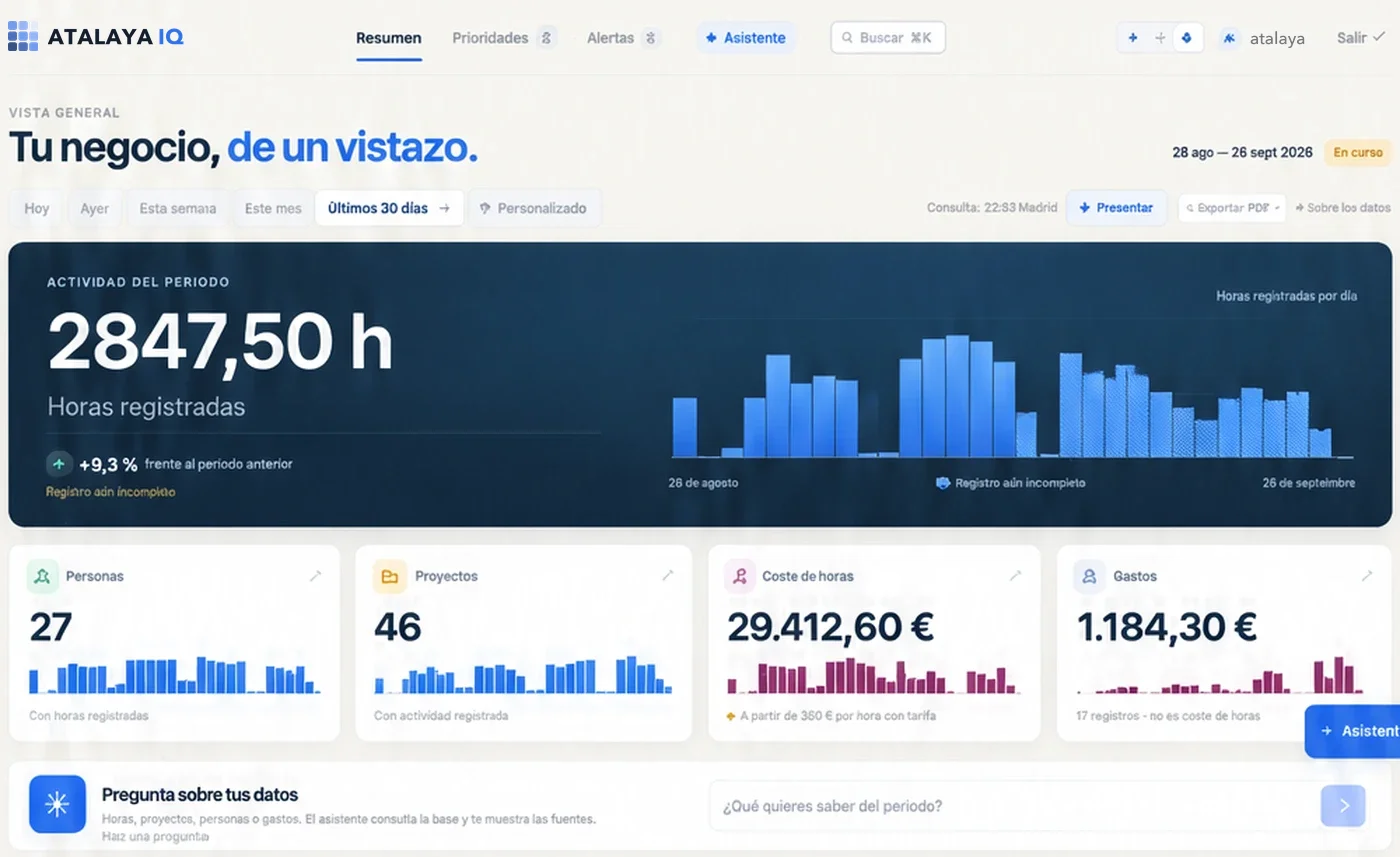
AtalayaIQ overview: hours logged over the last 30 days with their daily series, people, projects, labour cost and expenses.
Overview · last 30 days

Business intelligence

AtalayaIQ

A management dashboard that answers what needs attention today and shows why.

  • Front page with a “three lines” summary and at most 15 prioritised actions.
  • What changed against the previous period, compared at the same logging cut-off.
  • Alerts with detail, a recommended action and paginated evidence.

STACK Nuxt / Vue / MySQL

Case study: AtalayaIQ
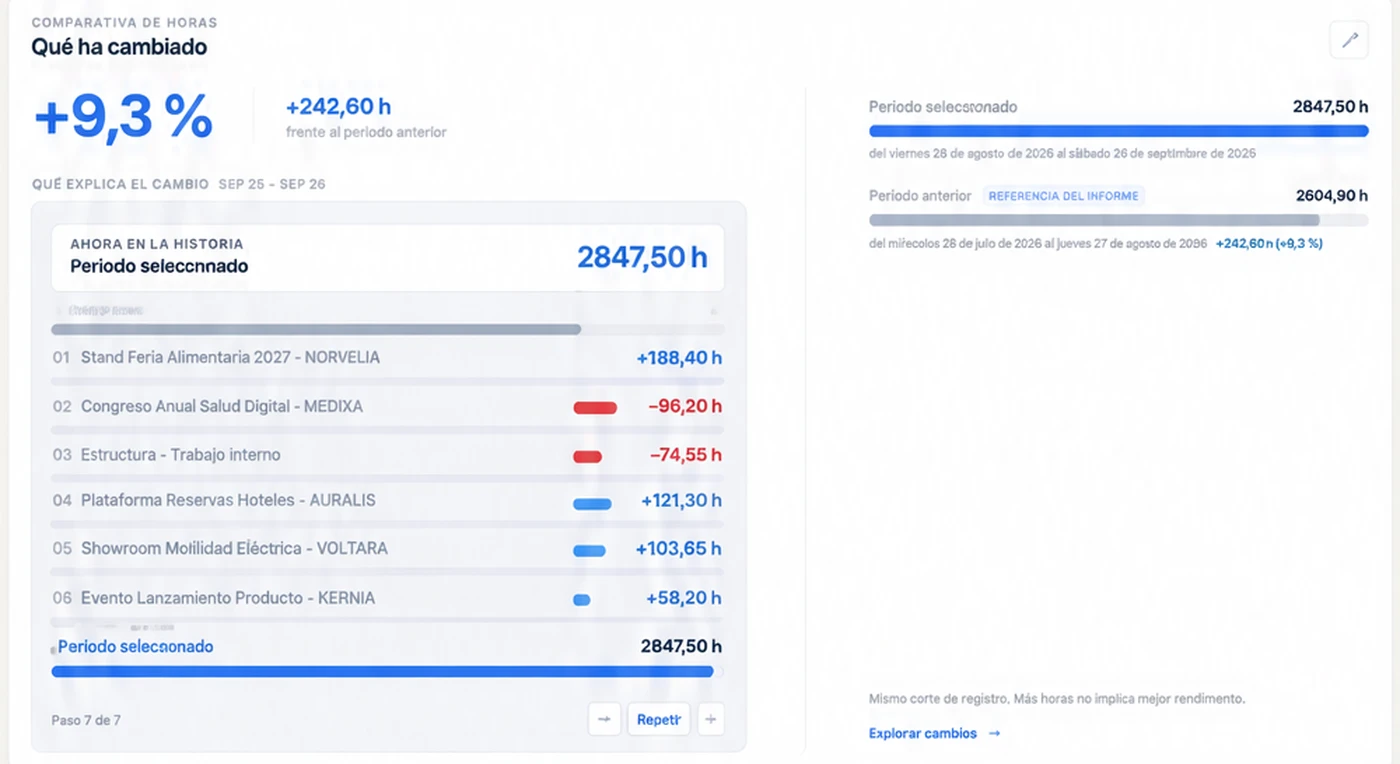
AtalayaIQ comparison with the previous period and the change that explains it, with demo data.
What changed · compared at the same logging cut-off
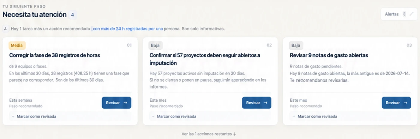
AtalayaIQ recommended-action cards: records to fix, open projects without activity and pending expense notes.
Needs your attention · actions with evidence
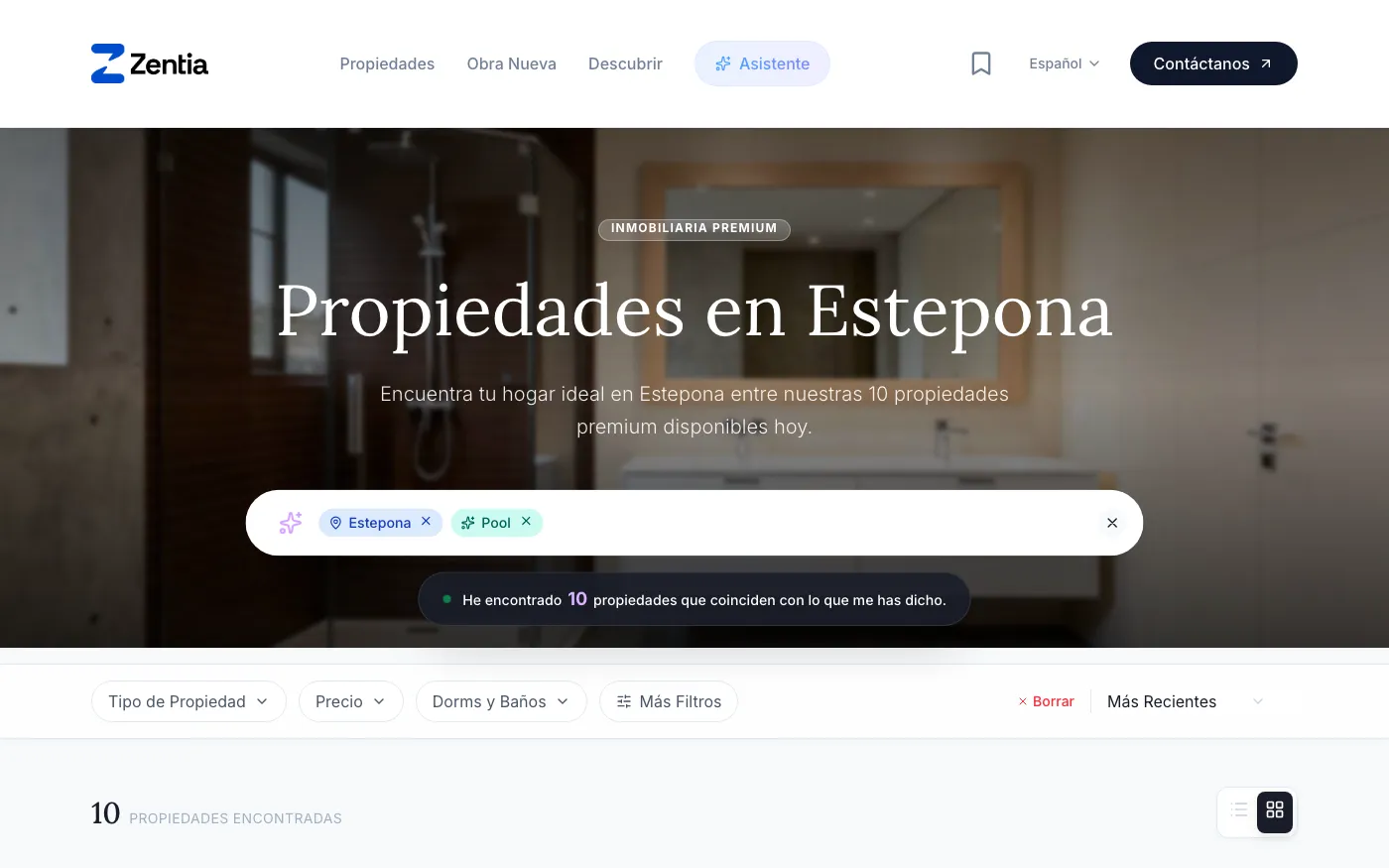
Zentia search: the Spanish phrase «casa en Estepona con piscina» (house in Estepona with a pool) turned into the filters Estepona and Pool, with ten properties found.
Natural-language search · zentia.pro

Multi-tenant platform

Zentia

A sales panel inside each agency’s platform, with its own data and only its own.

  • Most viewed properties, leads by source and an activity map.
  • Leads with statuses and the most active ones flagged.
  • Each agency sees only its own panel, isolated in the database.

STACK Nuxt 4 / Supabase / PostgreSQL

Case study: Zentia

10 / DON'T BUILD

When not to build a dashboard.

A chart with no question behind it is decoration with a maintenance cost.

Better to wait if…

  • It isn’t clear yet what the dashboard should help decide: the questions come first.
  • The underlying data has no reliable definitions. That’s Business Intelligence work, and it comes first.
  • The questions are standard and the data already lives in one tool: its built-in dashboard or Looker Studio is enough.
  • The goal is to impress in a presentation, not to decide better on Monday morning.

11 / QUESTIONS

Questions about KPI dashboards.

01

What is a KPI dashboard?

A view that brings together the key indicators management or a team uses to follow how the business is doing and decide what to do. The useful ones have few indicators, well defined, connected to real data and ordered by what needs attention.

What is a management dashboard?
02

What’s the difference between a dashboard and Business Intelligence?

The dashboard is the surface: the screen that answers specific questions. Business Intelligence is the layer underneath: source integration, definitions, reconciliation and rules. A dashboard without that layer shows figures confidently even when they’re wrong.

03

Why not build the dashboard in Power BI, Looker Studio or Metabase?

They’re good tools and often the right choice: a Power BI dashboard works well if the data is already in order and the questions are standard. A custom dashboard makes sense when the logic is your own (comparisons at the same logging cut-off, alerts with evidence, prioritised actions) or when it has to live inside the tool your team already uses.

A Power BI dashboard management actually uses
04

How many metrics should a dashboard have?

The ones that answer the questions decisions are made on. In AtalayaIQ, the front page sums up the situation “in three lines” and shows at most 15 actions, with no filler.

05

How often is the data updated?

Whatever the decision needs. For management a daily cut-off is usually enough; for operations it may need to be close to real time. What matters is that the dashboard says when the data is from and which part is still incomplete.

06

Can a dashboard alert me without opening it?

Yes. The same rules that highlight something on screen can trigger an alert or a periodic report. In AtalayaIQ the daily and weekly report arrives ready, with the prioritised action plan.

Read the AtalayaIQ case study

12 / SAME SYSTEM

Related systems.

A business problem rarely lives in a single piece. These usually appear in the same project.

All systems

Which question do you ask yourself every Monday?

Tell me what you decide, how often and where the data that answers it lives today. The dashboard is designed from there.