Before building a dashboard, decide what it won’t claim
A dashboard that claims what the data can’t support is worse than none. What to leave out, how to compare and when to stay silent is decided before the first chart.
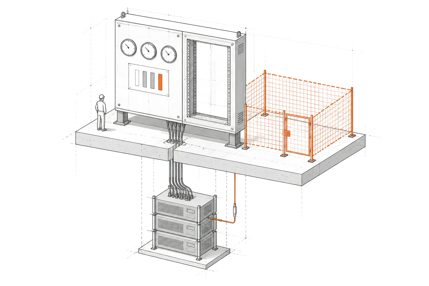
Picture a Monday morning. The management dashboard says activity has dropped 30% compared with last week. Someone calls a meeting, explanations are demanded and measures are prepared. By midweek it turns out nothing had dropped: Monday’s data simply hadn’t been logged yet.
The dashboard didn’t lie. It did exactly what it was asked to do. The problem is that nobody had decided what it shouldn’t claim.
A good dashboard is defined as much by what it shows as by what it refuses to claim.
The risk isn’t not knowing, it’s knowing wrong
A dashboard gives data a visual authority it doesn’t always deserve. A big number, a red colour and a downward arrow convey certainty, even when the figure is miscalculated.
Without a dashboard, management knows it doesn’t know, and asks. With a wrong dashboard, it thinks it knows, and decides. That’s why the first job of a dashboard isn’t choosing charts, but answering some less glamorous questions:
- What does each piece of data really mean, and since when has it meant that?
- Which data arrives late, incomplete or duplicated?
- Which questions can’t be answered with what you have?
- What is each figure compared against, so the comparison is fair?
What I learned building AtalayaIQ
AtalayaIQ is an intelligence layer over seven years of a national events company’s operational data: hours, projects, phases, expenses and travel. The goal was for management to have a reliable daily reading of what’s going on.
The data had to be read carefully. Hours are logged late. Some expenses can overlap between types. The public-holiday calendar stopped being maintained in 2022. A naive dashboard would have shown the wrong figures with complete confidence.
Almost every important decision in the project was about what not to do.
Leave out what can’t be claimed
Budget, revenue, progress, margin, profitability and forecasts are excluded by design. Not because they don’t matter, but because the database doesn’t contain the data to calculate them. Any figure on those would have been an estimate presented as a fact.
It’s the hardest decision to defend in a meeting, because everyone wants to see the margin. It’s also the one that protects the dashboard most.
Compare fairly
Each day is compared with the previous day of the same type and at the same logging delay. If at ten in the morning only part of today’s hours have been logged, it’s compared with what had been logged at the same point on the equivalent day, not with a day that’s already closed.
Without that, the system would announce drops that don’t exist. Exactly what happened on the Monday at the start.
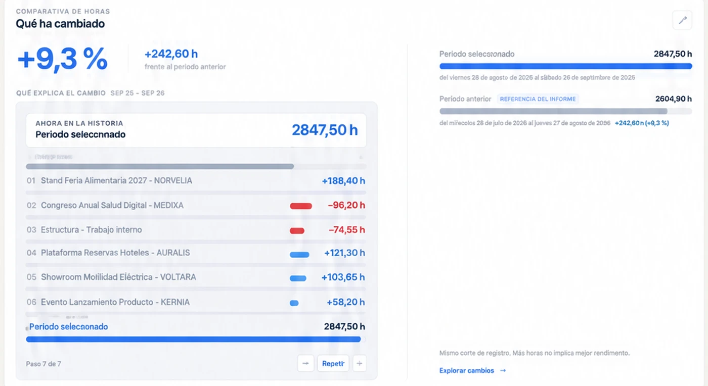
Periods are also calculated in Madrid time, and tested against the 23- and 25-hour days when the clocks change. It’s an invisible detail until the day a weekly report comes out with an extra hour.
Say how much each figure covers
Labour cost always states which share of the hours has a rate. If part of the hours has no rate assigned, the total cost is partial, and the dashboard says so. A figure without its coverage invites being read as complete.
Reconcile before showing
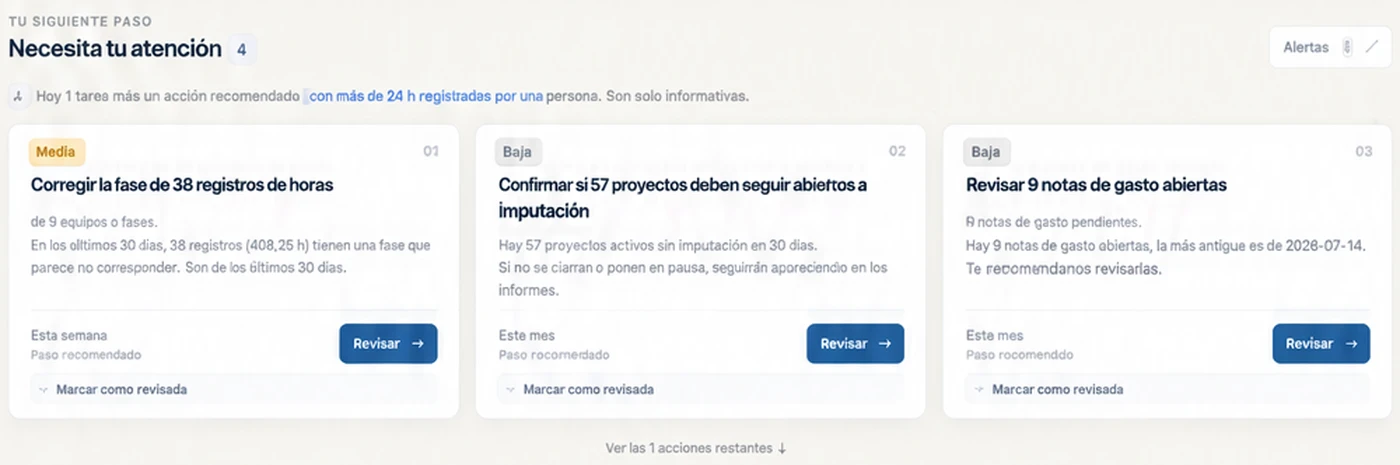
Everything the system claims has been reconciled independently with hand-written SQL: hours, costs and findings match. Alerts aren’t decided by an AI: they come from seven deterministic rules, each with its evidence.
Staying silent is a feature too
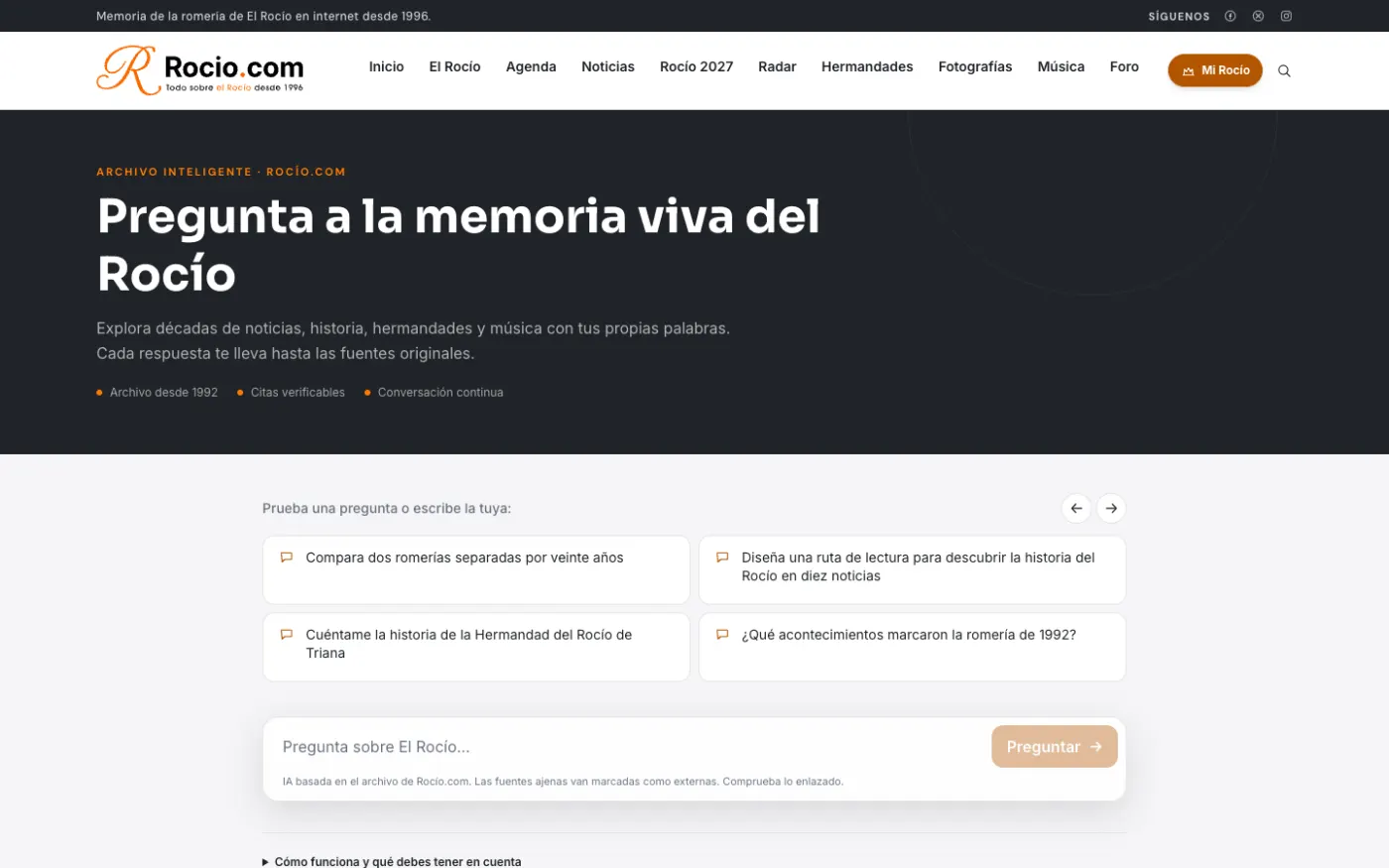
Rocio.com has an AI assistant over its archive, with an internal conversation viewer. The obvious temptation was to pull out trends: what people ask, which topics are growing.
The decision was no trends without volume. With few conversations, any trend would have been an unsupported claim. The analysis is postponed until there’s enough data. Sometimes a system’s right answer is “I don’t know yet”.
Before the first chart
If you’re going to build or review a dashboard, this order saves a lot of trouble:
- Write down management’s question. Not “see sales”, but “what do I need to deal with this week?”.
- Write a data contract. What each table contains, what it really means and with what caveats.
- Write the exclusion list. What the dashboard won’t claim, and why. Let management see it before you start.
- Define every comparison. Against what, at which cut-off and in which time zone.
- Reconcile another way. If a figure doesn’t match an independent query, it isn’t published.
- End in an action. Every alert with its evidence and what should be done.
Only then does choosing charts make sense. And far fewer are usually needed than people thought.
A reliable dashboard isn’t the one that shows the most, but the one that never claims what it doesn’t know.
Custom KPI dashboards explains how I design dashboards that start from management’s question and end in an action. If the problem is earlier, in data nobody reads the same way, what you need is custom Business Intelligence, and how to implement Business Intelligence covers the steps. If your dashboard lives in Power BI, how to design a Power BI dashboard management actually uses applies these ideas to that tool.